
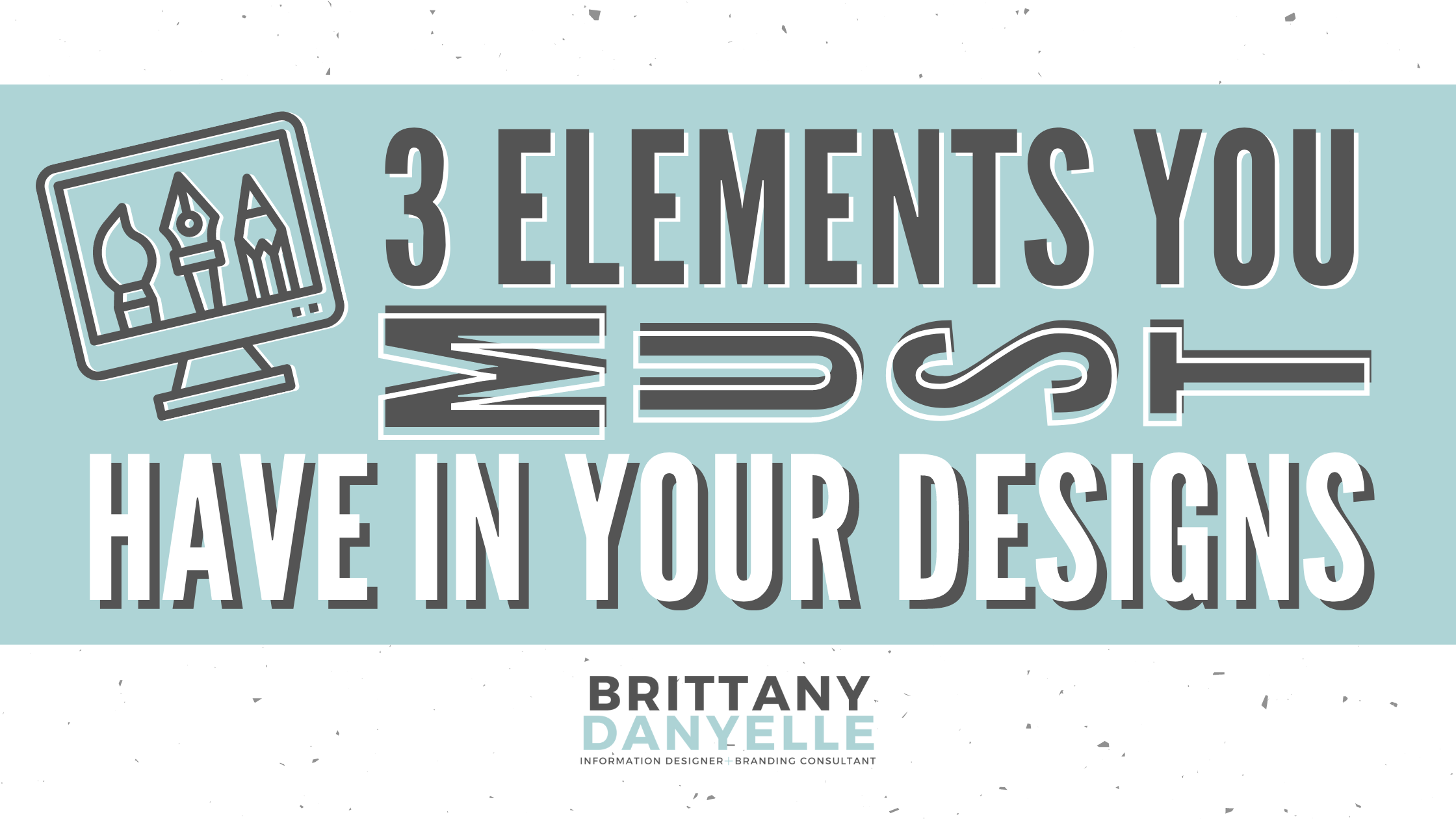
3 Elements You Must Have in Your Designs
A couple of weeks ago, I was attending a happy hour for Find Ventures. I met some inspirational people and had some great conversations. While in discussion with someone about social media communications work and design, we talked about how labor intensive it can be and the blessing and the curse about how everyone is not going to remember what you just poured your heart and soul into. The blessing is you can be human and make mistakes. The curse is a marketing campaign can consume your whole life and if it lands perfectly, the reality is most won’t even remember it.
This person turned to me and asked, “If you could list three things you look for in every design piece you put out, what would you say they are?” I found this question excellent for a blog post for anyone else who may be wondering the same thing.
1. Your Logo
This one’s pretty obvious and most small businesses and nonprofits include their logo on any design pieces they put out. But it’s worth mentioning because it’s a definite MUST. The last thing you want is for your great design piece to get copied and reused by someone else and the credit doesn’t go back to you and your organization.

2. The Purpose
What is the main purpose of your piece? It should stand out. Usually some questions you can ask yourself are:
“What action do I want my audience to take?” Do you want them to subscribe to a newsletter? RSVP for an event? Or simply learn something and start to see you as a thought leader in your space.
“What is my primary goal from this content?” Similar to what action you want people to take, but is your goal to garner trust from your audience? Maybe it’s to get people to buy your product or service? You most likely won’t hit your overall campaign goal with one piece of content, but just knowing what your goal is for your campaign and always having it in the back of your mind as you design.
“Is the purpose obvious?” Don’t distract an image with too many asks and too many facts. Keep it simple.
3. Sparks Interest
Make sure the piece is visually appealing. You want your design to *pop* enough to grab attention, and is balanced so it’s not distracting from the message. If you want a quick overview of colors and how they work together, check out this color combination cheat sheet. If you use Canva for your designs, they also have some color palettes and font sets that you can choose from and are already “designer” approved!

Use these three elements in all of your creations to ensure that your designs *pop*, they are well balanced, and you receive the credit that you deserve.
Let me know if you have any design related questions and I can address it in a future blog!
Make it yours,
Brittany Danyelle